


Client Re:Activ
Project type Branding / Website Design
Release 2023
The aim FWRD were tasked with evolving our client’s brand from an established freelance outfit, to a modern, standalone business, with a broad and flexible content offering.
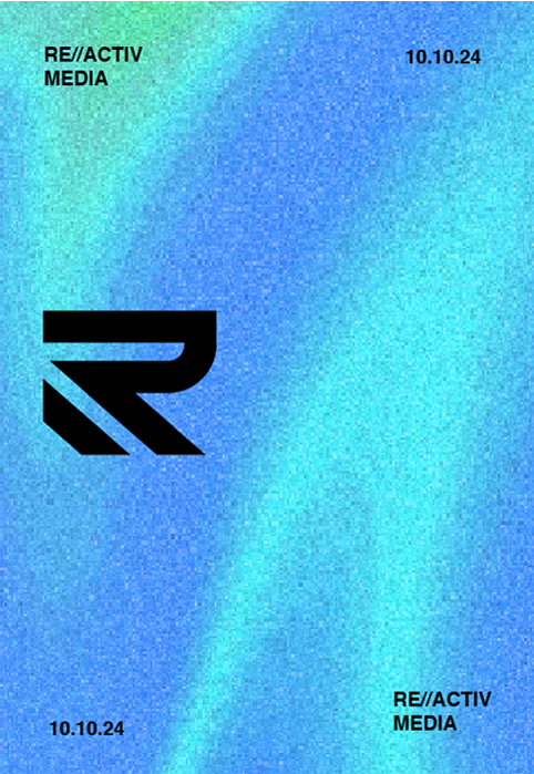
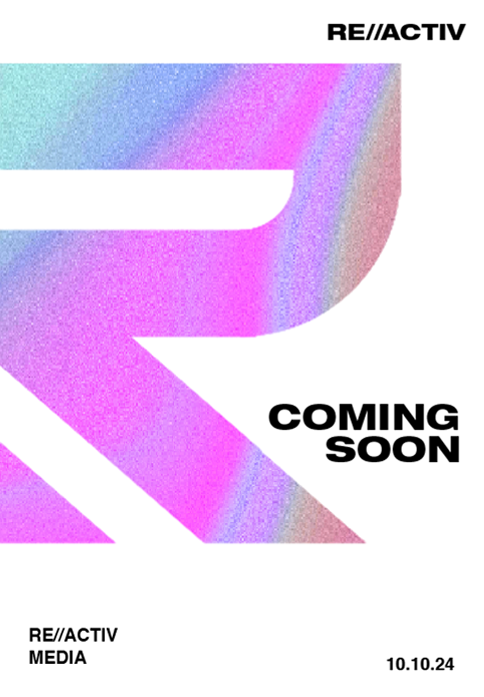
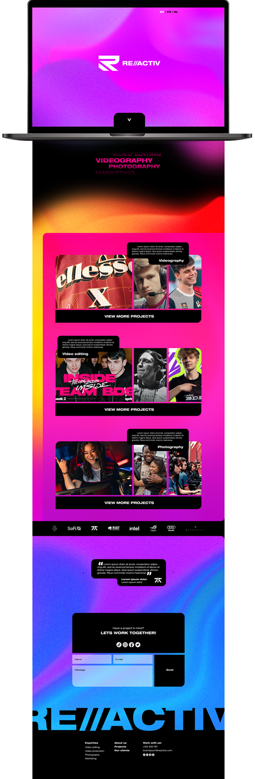
The remedy We worked closely with Re:Activ to tailor a grounded, ‘business-first’ logo set, while still maintaining the client’s youthful, creative foundations. The eye-catching, visually textured colour palette lent itself incredibly well to a mature and flexible company face.
The result Re:Activ is readily identifiable with a unique look. The foundation we have built together with the client has them now ready to commence the next phase of their external marketing and grow into the next years.
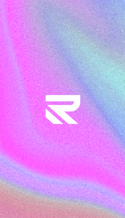
Logo
Vertical Lock Up
Horizontal Lock Up
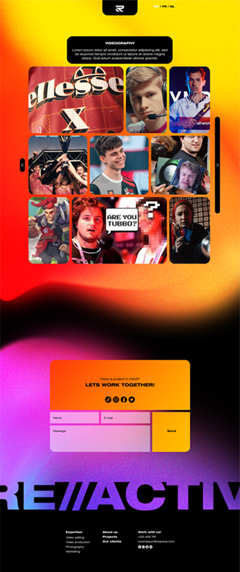
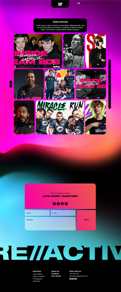
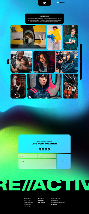
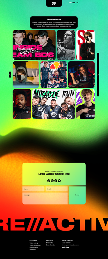
Color palette As gradients are primarily use in the brand. Colours should be bright and lively.
Texture Reactiv use flowy gradient and noise texture as imagery and background.
Typography Helvetica Neue is the brand typography. Headline should always stand out. The use of extended, bold, and heavy fonts are encouraged.


TELL US ABOUT
YOUR REQUIREMENT
Drop us an email or fill out our form and we’ll be in touch!
hello@fwrd.co or Schedule a meeting